


- Home
- >
- Inbound Marketing
- >
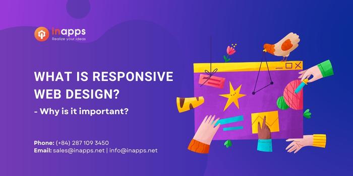
- 3 reasons why you must have a responsive Web Design
Here are the TOP 3 Benefits of Responsive Web Design
Your website is the face of your company. Whether a customer’s first time on your site or a native user of your services, their experience should be memorable.
So, when it comes to web design, your website should be optimized for however the viewer may see it. Put the customer first, right?
The key to this experience is incorporating a user-friendly layout into your website. Once you have done this, you can reap the benefits of responsive web design.
In this beginner’s guide, we’re going to cover the basics of responsive web design and how it can benefit you. For starters, you’ll learn:
- What is responsive design?
- 3 key reasons to use responsive design
- How to measure your design’s success
It’s important to make your website easy for mobile use. Don’t worry, it’s not as complicated as it sounds. So, let’s dive in.
Key Summary
- Overview: The article discusses the advantages of responsive web design (RWD), which ensures websites adapt seamlessly to various devices and screen sizes, enhancing user experience and business outcomes.
- Key Benefits:
- Improved User Experience: Automatically adjusts layouts, images, and content for optimal viewing on desktops, tablets, and smartphones, reducing zooming or scrolling.
- Increased Mobile Traffic: Caters to growing mobile users, improving engagement and retention on mobile devices.
- Cost Efficiency: Single website design eliminates the need for separate mobile and desktop versions, reducing development and maintenance costs.
- SEO Advantages: Google prioritizes mobile-friendly sites, boosting search rankings; single URL simplifies indexing and avoids duplicate content issues.
- Faster Load Times: Optimized images and responsive techniques enhance performance, reducing bounce rates.
- Cross-Platform Consistency: Ensures uniform branding and functionality across devices, building user trust.
- Future Scalability: Adapts to new devices and screen sizes, making websites future-proof.
- Use Cases:
- E-commerce platforms needing seamless shopping experiences across devices.
- Corporate websites aiming for broader audience reach and better SEO.
- Content-driven sites like blogs or news portals targeting mobile readers.
- Challenges:
- Requires skilled developers to implement complex responsive frameworks (e.g., Bootstrap, Tailwind CSS).
- Initial design and testing across devices can be time-intensive.
- Performance optimization needed to avoid slow loading on low-end devices.
- Conclusion: Responsive web design is essential for delivering user-friendly, cost-effective, and SEO-optimized websites, ensuring accessibility and consistency across devices while supporting business growth in a mobile-driven world.
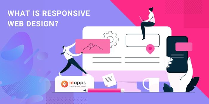
What is Responsive Web Design?
Your website is how you present your business to the world, so you want to try everything you can to make it easy and accessible.
A static website design optimized only for desktop viewers is no longer acceptable. You have to step up your game.
Responsive web design ensures that the content on your website is consistent and easy to view on any device. Simply put, a responsive design ensures that your website can adapt to the viewer.
Why Responsive Design is important
Nowadays, people can access your website from a plethora of devices. You want your site to be perfect, whether it be a cellphone, laptop, tablet, or smart TV.
Google says, “While nearly 75% of users prefer a mobile-friendly site, 96% of consumers say they’ve encountered sites that were clearly not designed for mobile devices.”

Although it may sound like a headache, this is a big opportunity for web designers. If your website is responsive to the user, you’re one step closer to winning them over.
Responsive design is enticing for users because it makes their lives easier. When you prioritize the viewer, they are more likely to choose you over your competitors.
Adaptive versus Responsive Design

Now that we know the importance of website adaptability, let’s discuss the difference between adaptive and responsive design.
Adaptive design changes the layout of a website depending on the device. With this, there are multiple versions of the same webpage, and it looks different on each device.
On the other hand, a responsive design aims to keep your page consistent on all devices. In most cases, responsive design is more desirable because viewers will be able to recognize the uniformity no matter the device.
But wait, there’s more! Let’s delve into some of the benefits of responsive web design.
3 key benefits of responsive Web Design
If you still aren’t convinced of the importance of responsive web design, here are three reasons it can benefit your business.
-
Attractive mobility
As I mentioned earlier, viewers like it when you prioritize their experience. According to Google, “48% of users say they feel frustrated and annoyed when they get to a site that’s not mobile-friendly.”
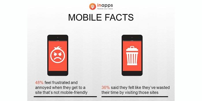
You want your website to be an oasis. Responsive web design is an escape from the frustration of stagnant sites.
This is one of the major benefits of responsive web design because you can welcome an influx of mobile traffic with open arms, no matter the device.
-
Lower costs and maintenance
Since responsive design presents the same version of a webpage on all screens, it saves you time and money. You don’t have to worry about transferring changes from the desktop version to the mobile version because everything’s in the same place.
Instead of harping on perfecting the site layout for every possible device, the responsive approach lets you maintain your website in an all-encompassing format. This way you can ensure all changes remain consistent and manageable.
-
Faster load times
We know that the user experience is of the utmost importance when viewing your site, so you want to do everything you can to make sure they don’t click away.
If your site takes more than a few seconds to load, you’ve already lost the game. A responsive design guarantees quicker loading time, so you have more time to wow viewers with your content.
One of the easiest ways to provide faster site speed is to optimize the image displays and integrate caching on your website.
You might think, “Well, that sounds great, but how will I know it’s working?”
Great question! Here’s how to measure your responsive website’s performance.
How to measure your Web Design’s Success
Now that you’ve established a perfectly responsive site, you want to see it in action. Luckily, the benefits of responsive web design are tangible.
Here are some measurable analytics you can count on.
Increase in mobile visits
With a completely responsive site, you can count on a steady inflow of mobile traffic. People will appreciate your website’s accessibility, so they might find themselves coming back for more.
It won’t happen automatically, but that’s what good digital marketing is for!
Decrease in bounce rates
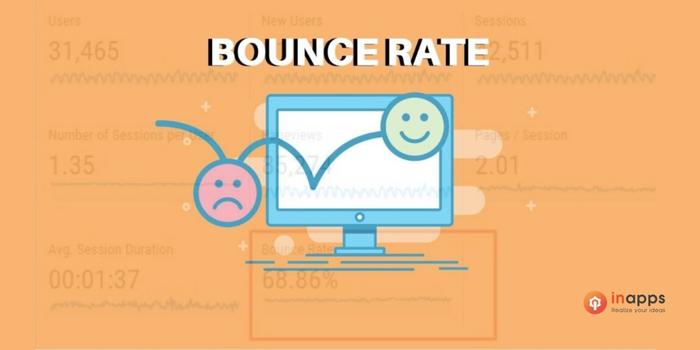
Mobility and fast-loading pages are major attractors for users. It gives them more time to explore your site which decreases bounce rates.
If you hit these markers, odds are they will stay on your website for longer.
Boost in Conversions
Since your responsive design is consistent across all platforms, it prioritizes user experience. Easy mobile access and lower bounce rates lead to an increase in conversions.
You’ll find that you get more mobile conversions with responsive web design.
And hey, a lead is a lead.
Overall, analytics are easier to follow with a responsive site that compiles everything you need in the same place.
Now you know the benefits of responsive web design, you can put your knowledge to the test.
Need help getting your website off the ground?
Look no further! We’ve perfected the foolproof web design process from copywriting to design work.
Our expert strategists and web designers at InApps can help you determine how to make the most of your website.
We offer technical SEO services that can improve your site speed improving your website’s SEO.
For more information, talk to a strategist today to see how we can make the perfect website for your business.
List of Keywords users find our article on Google
[sociallocker id=”2721″]
| website design |
| web design |
| responsive |
| website designer |
| web site design |
| design website |
| storybrand website examples |
| responsive web design |
| website funnel easy fast |
| design |
| web page design |
| website traffic viewer |
| responsive website design |
| web design services near me |
| responsive web design near me |
| web design company near me |
| web design and marketing near me |
| web traffic viewer |
| wed design |
| websitedesign |
| benefits of responsive web design |
| web desing |
| web design around me |
| odoo website |
| website design company near me |
| examples of storybrand websites |
| reponsive |
| resposive |
| web desgin |
| web-design |
| web designa |
| website deisgn |
| webiste design |
| “web design” |
| wesite design |
| best odoo apps |
| adaptive benefits administration technology |
| adaptive benefits administration software |
| theme odoo |
| responsive viewer |
| odoo seo web |
| odoo blockchain |
| web benefits design |
| storybrand example websites |
| odoo seo |
| call center quality assurance best practices |
| quality assurance best practices call center |
| seo company in reading |
| webdesign expert |
| respensive |
| responsive. |
| respinsive |
| respondsive |
| web design. |
| website deisng |
| web desig |
| web desine |
| web desings |
| webdesine |
| wensite design |
| web designe |
| website desgin |
| web degine |
| web desigin |
| “inbound marketing” seo or marketing or “pay-per-click ads” or “hubspot services” |
| the frustrated engineer |
| responsive benefits administration |
| “web design” seo or tool or ideas or best |
| responsive funnels |
| inbound expert target |
| ecommerce web design vn |
| key benefits |
| web design benefits |
| responsive website benefits |
| responsive web design importance |
| website designers |
| what is inbound expert target |
| “inbound” |
| ground branch key |
| get your odoo customize |
| why responsive web design is important |
| openerp web |
| website design near to me |
| best web designers near me |
| chatter desktop |
| e-commerce benefits |
| web design design near me |
| 7tan |
| america first ecommerce website developer florida |
| odoo maintenance |
| benefits by design |
| device-responsive payment pages |
| odoo elearning |
| responsive industries |
| web deisgn |
| quick website design tips to retain visitors try the 5 second test |
| ward davis i got you |
| design thinking what is what if what wows what works |
| odoo offshore development |
| web designers salary |
| simply crm |
| marketing coordinator |
| web design agencies near me |
| creative responsive web design |
| responsive website development |
| web design seo services |
| web design and seo services |
| technical seo services company |
| tips for choosing a web design company |
| website design services |
[/sociallocker]
Let’s create the next big thing together!
Coming together is a beginning. Keeping together is progress. Working together is success.


