
Data Visualization and Observability: The Critical Bridge to Taking Action is an article under the topic Data Science Many of you are most interested in
New Relic sponsored this post.

Jason English
Jason is principal analyst and CMO at Intellyx, where he advises leading technology solution providers and software startups as they navigate digital transformation. His enterprise software background includes supply chain, interactive design, software development and testing, virtualization, cloud computing and blockchain.
As a young Information Architect in the earliest of web interactive agencies, I greedily absorbed any good examples of data visualization I could find, from the coffee-table sized Edward Tufte series of books, to novel representations of quantities and events in classic video games like Railroad Tycoon and Civilization.
Delivering a good summary view that surfaced the most relevant aspects of underlying data for users was a challenging enough job when monitors were low resolution and connectivity was low bandwidth. But the flow and quantity of data we’re grappling with today would have been unfathomable back then — not just in terms of throughput and system capacity, but from a human factors perspective. How could I expect end users to make sense of all this data?
Data visualization involves designing and engineering a human-computer interface, or metrics dashboard, to allow better human cognition and analysis of data atop live data streams and archived data.
While the concept of data visualization is quite mature by now in business and scientific analytics circles, the intuitive display of ever-expanding quantities of data still offers plenty of room for innovation in the software observability space.
Good data visualization is the critical bridge to making the near-unlimited operational and application data consumed by observability solutions understandable and actionable on the part of humans, and ultimately improve customer experience.
Beyond the IT Ops Control Center
IT Operations teams have long used “mission control” style dashboards to monitor active system events, metrics and network traffic for potential anomalies. These data visualizations could be kept on wall monitors in the IT team room, or running in a window on the engineer’s desktop.
Starting from expected Service Level Objectives (SLOs), the Ops team sets thresholds for performance issues such as flagging response times, or threat events such as DDoS attacks. Hopefully, the metrics dashboard is well-designed enough to make an incident recognizable by the engineer on-call, so they can kick off a trouble ticket.
Read More:
The Growing Complexity of Kubernetes — And What’s Being Done to Fix It – InApps Technology 2025
Data visualization of system events and metrics is a wonderful thing for SecOps teams, but often leaves development and business stakeholders out of the issue remediation and continuous improvement loop.
Furthermore, operational metrics alone have a growing blind spot when it comes to the expected customer experience of modern applications.
Transparency Requirements for Complex Applications
No serious application lives in isolation anymore. Today’s highly distributed systems are moving workloads out of monoliths and centralized app servers, to take advantage of hybrid architectures that may encompass hundreds or thousands of disparately located microservices and API calls.
Sponsor Note

New Relic delivers real-time insights that software-driven businesses need to innovate faster. New Relic makes every aspect of modern software and infrastructure observable, so companies can find and fix problems faster, build high-performing DevOps teams and speed up transformation projects.
In addition, DevOps automation allows organizations to drive more code changes and deploy configurations into elastic cloud architectures faster. With delivery pipelines moving at breakneck speed to meet customer demand, maintaining observability in an actionable form is harder than ever.
One bright spot? Open source metrics from tools like Grafana and Prometheus and standards initiatives like OpenTelemetry provide the capability to better consume and collate incoming application data (events, alerts, metrics, traces) from a constellation of such heterogeneous servers and services.
With the cooperation of a global developer and vendor community, any telemetry data source worth gathering will be adapted for use in observability. But what to make of all this data?
All stakeholders need a current view of the entire environment — not just for critical alerts into system-level issues, but also to understand the changes and trends happening across the broader application estate. All with clear enough visuals to convey business and operational reality in real-time, because anything less will impact reaction time.
The Power of Visualization Across an Application Estate
The most familiar IT data visualizations are rather Ops-focused and granular — showing views for the consumption of data storage or network bandwidth, or the utilization of sets of servers or VMs running in a data center, or the status of instances or containers running in a company’s cloud account.
New Relic recently showed me their New Relic Explorer platform, which can zoom out to provide a more global data visualization across multiple applications and services.
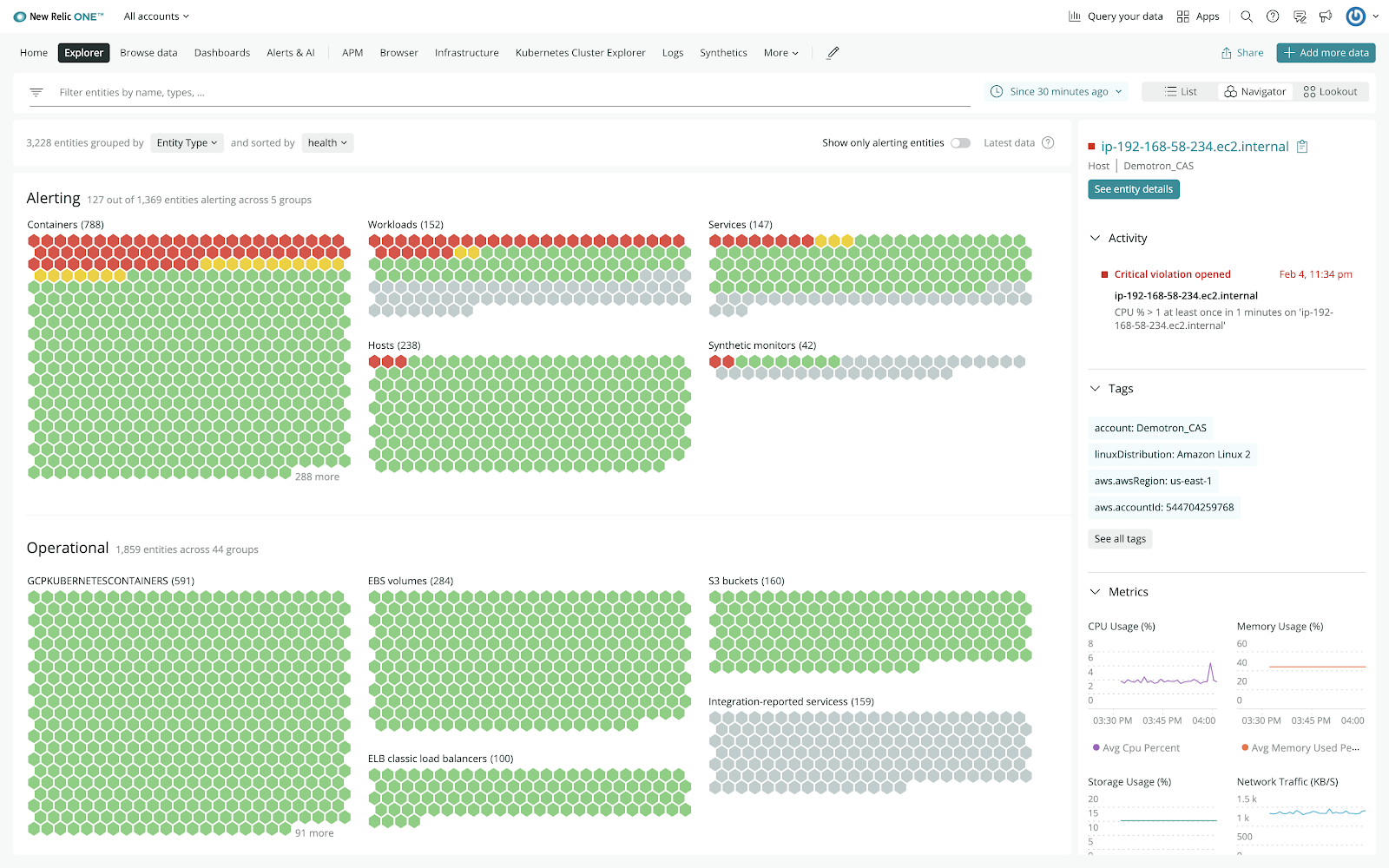
Figure 1. Global entity explorer view in New Relic Explorer. (Source: New Relic)
The big picture here? This high-density view discovers and encompasses any and all entities relevant to the business stakeholder’s extended application suite. Each of the little “hexes” shown here may be an on-premises app, an external service, or even a workload running on serverless architectures.
The user can quickly see how the green hexes are reporting normal status, and that the red hexes represent some type of alert. Click on any hex to start drilling down into detailed metrics and root causes.
Some discovered entities shown as gray hexes may either be dormant systems or simply not actively reporting yet — in which case the owner of that service could be asked to release the capacity allocation or better instrument it as a telemetry data source.
Read More:
Vietnam needs a legal framework capable of promoting the application and innovation of blockchain products
While this interface provides a powerful global status view, it may not provide the sensory feedback our human minds seek to solve when considering usage trends and spotting emerging risks over time.
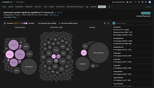
Figure 2. Tracking changes in key metrics in New Relic Lookout, shown here in Dark Mode which is all the rage these days.
Application stakeholders can literally “connect the dots” for observability by visualizing the relative changes in utilization, or the delta on any other significant metric over a range of time, using this interesting New Relic “bubble” view in New Relic Explorer.
The rate of relative change between these bubbles — including all related services and system entities in this adjacent view — provides the user with better visual context into the most significant trends that could impact customer experience.
The natural benefits to observability include fewer failures and faster issue resolution times. But when data visualizations go beyond typical charts and graphs, IT and business stakeholders can spot emerging opportunities for service improvement they weren’t even looking for.
The Intellyx Take
Data visualization forms a critical bridge between observability and human action. The value of observability is ultimately governed by the ability of both IT and business stakeholders to perceive, interpret, and take appropriate action upon a flood of data to predict potential problems and remediate failures across the entire application estate — as early as possible.
Fortunately, the complexity of keeping up with the tsunami of data emerging from today’s rapidly changing, highly distributed hybrid applications can be turned into a net advantage. The more telemetry data you sample across an entire application estate, the better fidelity data visualization can provide for clarifying exceptions from the norm, or spotting emergent patterns.
Intuitive interfaces to observability don’t just maximize application uptime and IT operational efficiency for the systems you own, they can generate a broader impact across the extended application estate for development success and business performance.
List of Keywords users find our article on Google:
Related Articles
Best Countries to Outsource Software Development (2026 Guide)
Software development outsourcing means hiring an external engineering team - usually based in another country- to design, build, or maintain software on your behalf, instead of hiring in-house. Most US, UK, and Australian companies do this to access skilled engineers faster and at a lower fully-loaded cost than domestic hiring allows.

How to Choose an Offshore Software Development Company in 2026
Search for "offshore software development company" and you'll get the same result every time: a list. Ten names, fifteen names, twenty-five names, each with a logo and a two-line pitch, and no real way to tell which one is actually right for your project
Are Developers Becoming Too Dependent on AI Tools?
AI coding tools went from novelty to daily habit in under two years, and the tools themselves keep getting better. But using a tool every day is not the same as trusting it, and a wave of 2026 research is starting to show a real gap between feeling faster with AI and actually being better at the job. Here is what the data says, and what it means for how you build and evaluate an engineering team.