- Home
- >
- DevOps News
- >
- 5 Dashboard Design Principles and Best Practices
5 Dashboard Design Best Practices to learn from.
In an increasingly data-driven world, the ability to summarize and display data while making it easy to understand and actionable is more important than ever.
Dashboards appear in all types of software with various approaches behind their design. Despite how they differ in appearance and the information they display, at a conceptual level all dashboards have the same goal and purpose.
The purpose of a proper dashboard design is to consolidate all the information needed to achieve a specific objective. What the objective is will have the biggest impact on how the dashboard is designed.
In this article, you will learn a number of best practices and design principles that are useful in any situation where you are designing dashboards to visualize data in your software application.
Key Summary
- Overview: The article compares three popular cross-platform mobile app development frameworks—Flutter, React Native, and Xamarin—evaluating their features, performance, and suitability for building iOS and Android apps.
- Flutter:
- Developed By: Google, using Dart programming language.
- Key Features:
- Fast development with hot reload for real-time UI updates.
- Rich widget library for customizable, native-like UI.
- Skia graphics engine ensures consistent visuals across platforms.
- Pros: High performance (compiles to native code), single codebase, vibrant community, ideal for startups and MVPs.
- Cons: Larger app size due to bundled libraries; Dart less widely used than JavaScript or C#.
- Use Cases: Apps requiring complex, visually appealing UI (e.g., e-commerce, gaming).
- React Native:
- Developed By: Facebook, using JavaScript and React.
- Key Features:
- Leverages native components for near-native performance.
- Large ecosystem with reusable libraries and third-party plugins.
- Hot reloading for quick iteration.
- Pros: Mature framework, extensive community, easy learning curve for JavaScript developers, used by major apps (e.g., Instagram, Airbnb).
- Cons: Performance slightly slower than Flutter for complex animations; occasional native module integration issues.
- Use Cases: Rapid development for apps needing social media integration or simpler UI.
- Xamarin:
- Developed By: Microsoft, using C# and .NET.
- Key Features:
- Native performance via direct access to platform APIs.
- Xamarin.Forms enables shared UI code across platforms.
- Strong integration with Microsoft tools (e.g., Azure, Visual Studio).
- Pros: Ideal for enterprise apps, robust tooling, C# familiarity for .NET developers.
- Cons: Slower development due to less efficient hot reload; smaller community; Xamarin.Forms can limit complex UI customization.
- Use Cases: Enterprise-grade apps with heavy backend integration (e.g., CRM, business tools).
- Comparison Highlights:
- Performance: Flutter and Xamarin offer near-native performance; React Native is slightly slower for graphics-heavy apps.
- Development Speed: Flutter and React Native excel with hot reload; Xamarin lags due to slower build times.
- Community and Ecosystem: React Native has the largest community, followed by Flutter; Xamarin’s is smaller but enterprise-focused.
- Learning Curve: React Native is easiest for JavaScript developers; Flutter requires learning Dart; Xamarin suits C# developers.
- Cost Efficiency: Offshore development (e.g., Vietnam at $20-$40/hour) makes all frameworks viable, with Flutter often fastest for MVPs.
- Recommendations:
- Choose Flutter for visually rich, high-performance apps with rapid development needs.
- Choose React Native for quick prototyping, broad community support, and JavaScript expertise.
- Choose Xamarin for enterprise apps with strong Microsoft ecosystem integration.
- Partner with providers like InApps Technology for cost-effective, skilled development in any framework.
User-First Design
When it comes to building and designing a dashboard, the user has to come first. Without taking into account who will be using the dashboard and what their goal is, you really can’t design a great dashboard.

Some questions you should ask are:
- Who is the intended user of the dashboard?
- What are their objectives?
- What type of data will they be using?
- How much detail does the user need?
- What devices will be used to access the dashboard?
At the end of the day, the only reason a dashboard is created is to add value for the user. The value of a dashboard is in making data easier to understand so that users can take action on that data; otherwise, people would just choose to look at the raw data in a spreadsheet.
As a designer or developer, this might be hard to hear, but utility should be your top priority when visualizing data within a dashboard.
Types of Dashboards
Dashboards have a ton of variety, but can be broadly broken down into three categories. When building a dashboard, it might be helpful to think about which of these categories your dashboard will fit into so you can think about which types of data visualizations will work best for your particular type of data and dashboard.
Operational Dashboard
The purpose of an operational dashboard is to give users an overview of what is happening right now. These dashboards will generally have real-time, or near-real-time, updating displays so users can act quickly on changes in data.
A typical operational dashboard use case would be something like software monitoring where the dashboard user wants to know quickly if something is going wrong.
Waiting an hour for a chart to update isn’t an option. Operational dashboards should be fairly simple so users can understand what’s happening with a quick glance.
Analytical Dashboard
Analytical dashboards allow users to analyze trends on longer timelines to drive business decisions. Data for these dashboards is less time-sensitive and won’t be required for quick action. This type of dashboard should make it easy for users to drill down and look deeply into any data that catches their attention.
Strategic Dashboard
Strategic dashboards are an even higher-level type of dashboard intended for long-term planning. They might be used to track the results of long-term company strategies and industrywide trends. The goal of this dashboard would be to allow executives to quickly understand the subject without having to dive into details.
Fundamental Dashboard Design Principles
In this section, you’ll learn about a few foundational design principles that you’ll want to keep in mind while designing your dashboards.
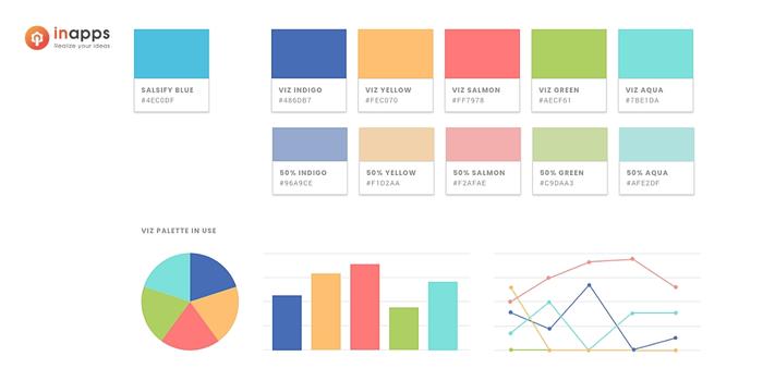
Color Design
Color is a great way to direct the viewer’s attention. Instead of using a bunch of bold colors, it’s a better idea to take a minimalist approach. Use contrasting or bold colors for the elements you want to draw attention to.
It’s also a good idea to account for what people already associate with certain colors. If you are building an operational dashboard that is monitoring something and has some sort of status value, you could have it set to green when everything is fine and red as a sign that something is wrong.
Intuitive color gradients can be used to display ranges of data and instantly give viewers an idea of what the data is saying. With this in mind, you probably don’t want to use colors like red and green for displaying categories, because people might automatically associate the category displayed with red as something bad.
Remove Unnecessary Elements
From a design perspective, anything that doesn’t convey useful information should be removed. Things that don’t add value like chart grids or decorations are prime examples.
This can also include things that look cool but don’t really add anything to the dashboard like a gauge chart where a simple number value gives the user the same information while taking up less space.
If you are conflicted, you should probably err on the side of caution and remove something if it doesn’t add any functional value. Space is a prized dashboard commodity, so you don’t want to waste any space on things that are just there to look pretty.
Use of Proportions
Using proportion and relative sizing to display differences in data is another way to make data easier for viewers to quickly understand. Things like bubble charts, area charts or Sankey diagrams can be used to visually show differences that can be understood with a glance.
Don’t Distort Reality
The purpose of a dashboard is to convey information efficiently so users can make better decisions. This means you shouldn’t try to mislead people or steer them toward a certain decision.
Modifying units or vertical scales to make changes seem larger than they really are could add confusion and distract from the data you’re trying to communicate.
This can even be done unintentionally by using the wrong type of chart to display information.
An example would be using a 3D pie chart which, depending on how it is rotated, can make certain sections look larger than they really are. Instead, a better alternative would be using a simple bar chart which has less risk of being misinterpreted.
Dashboard Design Best Practices
In this section, you’ll learn about some more actionable best practices that you can implement to improve your dashboards.

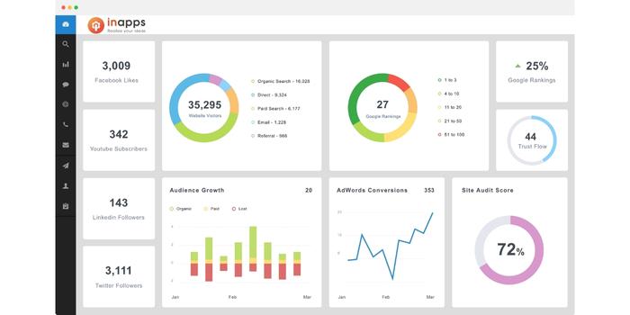
Best dashboard design 2022
1. Information Hierarchy
The information you are displaying on your dashboard should be organized logically. A number of user research studies show that people read in an F-shape pattern when viewing a page, with the top left corner of a dashboard getting the most attention and the bottom right the least attention.
This means that whatever data and insights are most important should get the prime real estate at the top left portion of your dashboard so it has the best chance at catching a user’s attention.
The rest of the dashboard should be displayed based on priority. Underneath the main section should be supporting details or trends. Below that, you can provide data tables or more specific information.
Information hierarchy across the entire application is also important. If a user wants to dive deeper into the details related to a certain section of a dashboard, they should be able to easily navigate to a new page or dashboard with that data.
2. Consistent Layout
Dashboard best practices
Having a consistent layout for your dashboard helps users be more productive and get the information they need without frustration. This applies to the layout of the dashboard itself as well as the charts included in the dashboard. Things like labels, legends, axis, styling and tools for each chart should be in the same place.
A good example would be a dashboard for a sales rep to get a quick overview of a customer account. Ideally, the dashboard will look the same for all customers in terms of layout, so a sales rep can still get a quick overview of a company even if they have just been moved to the account.
3. Provide Context
People using the dashboard should never be forced to guess or make assumptions about what they are looking at. This means you’ll want to make sure charts have titles and potentially subtitles to explain what they are displaying. Legends and labels should be provided to let viewers know what the data represents.
Using interactive elements, such as tooltips when users hover over a data point, is a good way to provide more context without having a bunch of clutter on your charts. Users only see additional information if they want to.
4. The 5-Second Rule
A common rule of thumb for dashboards is that a user should be able to find anything they need in under 5 seconds. If not, there are a few options to fix this problem. The first would be to remove any charts that aren’t relevant to the core objective of the dashboard to reduce clutter.
The second option would be to better organize the dashboard by grouping the different charts into relevant sections and putting labels and titles so users can find what they are looking for without getting lost. If the dashboard still seems too complicated after making these changes, you might want to break it into multiple different dashboards, with each having more focus.
5. Performance
Something that often isn’t considered when designing dashboards is the actual performance of the dashboard. Even if you get everything else right in terms of design, if the performance is terrible in terms of things like loading speed, the end-user will hate it.
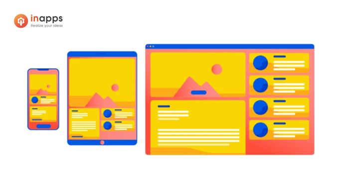
If you know many of your users will be viewing your application from mobile devices, you will have to account for potential issues with bandwidth and data fees. This might result in changing the way you initially load data or what types of features you include in the dashboard.
Another example could be not properly testing your dashboard for large datasets. A small test dataset might work just fine, but real-world datasets might slow the dashboard to a crawl.
The Foundation for Your Dashboard
If you keep the information you learned from this article in mind while creating your dashboard, you’ll have a pretty good foundation to start. You are never going to be perfect on your first try.
The key to great dashboard design is having an iterative process where you are constantly getting feedback from users, then improving your dashboard based on that feedback.
Contact InApps if you need an expert to realize and professionally design your dashboard.
List of keywords users find our article on Google
[sociallocker id=”2721″]
| best dashboard design 2022 |
| dashboard design 2022 |
| dashboard best practices |
| dashboard design best practices |
| dashboard design principles |
| operational dashboard design |
| good dashboard design |
| mobile dashboard best practices |
| best practices in dashboard design |
| dashboard layout design |
| top dashboard designs |
| great dashboard design |
| great dashboard designs |
| real time dashboard design |
| best practice dashboard design |
| best practices for dashboard design |
| software dashboard design |
| dashboarding best practices |
| good dashboard design principles |
| best practices dashboard design |
| dashboard best practice |
| dashboard ux best practices |
| 2022 dashboard design |
| dashboard design best practice |
| best dashboard layouts |
| dashboard design trends 2022 |
| dashboard design trends |
| dashboard trends 2022 |
| awesome dashboard design |
| dashboard layout ideas |
| dashboard design software |
| best dashboard designs 2022 |
| pps labels template |
| best dashboard design 2020 |
| the best dashboard design |
| dashboard good practices |
| dashboard layout best practices |
| best practice for dashboard design |
| best mobile dashboard design |
| best dashboard ever |
| dashboard design 2020 |
| best design dashboard |
| dashboard design guidelines |
| customer dashboard design |
| best practice dashboard |
| designing great dashboards |
| best dashboard design 2021 |
| best dashboard design |
| dashboard best design |
| dashboard design ideas |
| digital niche marketing |
[/sociallocker]
Let’s create the next big thing together!
Coming together is a beginning. Keeping together is progress. Working together is success.